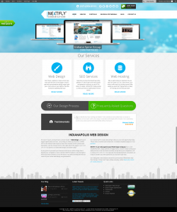
Website design changes frequently. What is popular a year ago, might not be the next. Right now, a lot of website designs come with a large rotating banner at the top of the page. Nextfly has one that you can see here:
The banner image takes up about a quarter of the website design – making it imperative that there is high-quality images and content there.
It’s important that the banner content area of your website is utilized to the best of its ability and here are some suggestions to do just that!
1. Showcase high-quality images
Because the image takes up a lot of space on the website, it is important that you have banner images that are a high resolution. Pixilated and stretched images are visibly noticeable and will give website visitors a poor first impression. Every website is different, so make sure you know your websites banner dimensions. Knowing this will help if you are graphically designing images to put in the banner or selecting the right size stock photos for it.
2. Highlight important products/services
Each company has something that sets them apart from others. You might be a lawyer that specializes in divorce, an engineer that works directly with the pharmaceutical market, or a clothing store that only sells plus-sized clothing. The website banner is a great place to highlight these products and services.
3. Promote company news
Do you have a event coming up that you’d like current or potential customers to attend? Did your company get a special award recently that you’d like to promote? Design a banner for it and let people know!
People process information better visually and the website banner is a great place to capture your audience and display important information. Banners are a huge asset to your website, make sure you use them effectively!

