2013 may be a step up in the digital realm, as most years are however, don’t expect the same from your web page designs in the way of busy graphics. We turned to ThemeiD for some of the hottest trends in web design for 2013. We found that simplifying is the way to go! So, what else can we expect in the way of web design?
Responsive Web Design
One big trend we’ll be seeing is Responsive Web Design (RWD). RWD is a web design focused on providing an optimal viewing experience. The design provides for easy reading and navigation.
Do you ever go to websites that you have to make smaller or scroll around to see the entire page? Well, RWD help eliminate some of that nonsense from your desktop to your smartphone. These designs adapt and respond with great layouts and mixed approaches. (For the computer geeks like we are out there.)
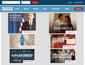
What does this mean for you? Your customers will appreciate your web simplicity. Here’s an example of Barack Obama’s website, which has always been on the leading edge of technology.
 |
 |
 |
Oversizing
Many companies are turning to oversizing photos and using them as backgrounds or using full-width background images along with huge text and buttons. This creates a big dynamic with the user. Images also help with emotional pull with people. Just like the saying “A picture speaks a thousand words,” it can do the same for your webpage.
Simplifying
Another web trend we’ll be seeing in 2013 is the simple design. We’ll see many companies embracing the white space versus trying to fill it in with something. Clean, simple, and direct can all help lead to an easy to understand web experience. Have you seen Apple’s website?
We’d love to help answer any questions you may have. Give us a call at 317-219-3111.
