This past September I was reading social media posts and came across a story about a new social media website called, Ello. Instead of brushing it aside, I decided to put my email in to try the new beta.
It was weeks after that I finally obtained my invitation to sign up for the service and, much like Tom from MySpace, it was the founder of Ello, Jay Zeschin that invited me.
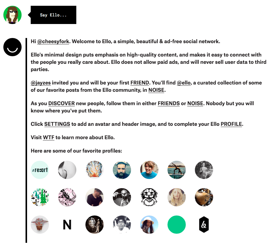
The first thing that popped up when I signed in was a short description of the purpose of Ello, followed by a few tips on how to use it.
Let me tell you – I did an awesome job of ignoring it all and just started clicking around to see what the website had in store. That was a mistake.
Ello is very minimal in design. There aren’t any fancy buttons that say “settings” or “post here!” Instead, there is a tiny gear and a small box that says “Say Ello…” that you click into to post something on your personal profile.

My second stop on the website was to click around Ello’s list of “Favorite Profiles” to see why others had chose to use this platform. What I discovered was that the platform was mostly used for people to show off their pretty pictures. At least, that’s what most of the profiles I clicked were.
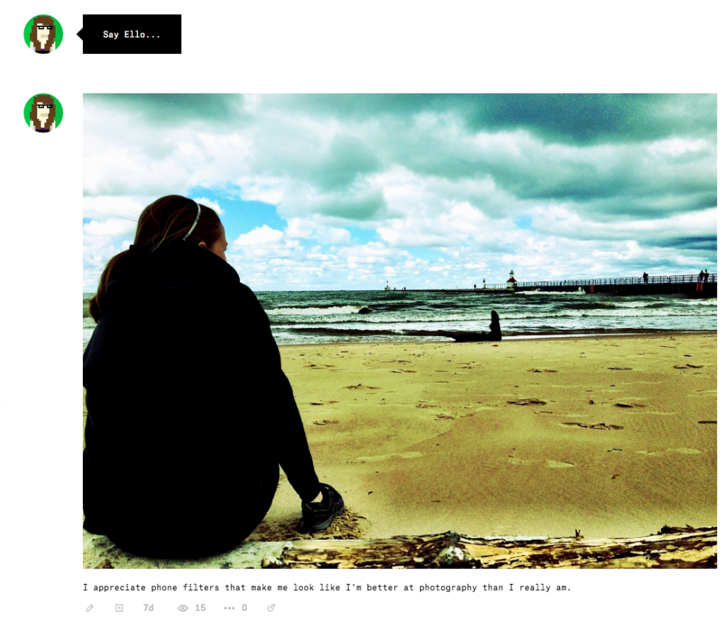
Due to this, I knew exactly what my first post would be. So, I clicked the gear to put together my profile and searched through my phone for some ridiculously-filtered iPhone pictures I’ve taken.
When trying to upload the photo, it took me about 15 minutes to figure out how to actually post the photo. Initially, I thought it was user error, but I was mistaken. The browser size made the “post” button disappear.
BUT…I made it happen and HUZZAH!
My first post:

So, I’m sure the next question you have for me is “what is Ello like?” …”is it similar to anything out there?”
The answer? Yes.
To me it is quite similar to Tumblr. Very image-heavy, but yet social. It’s not like Instagram, that is completely image focused. On Ello, you might have one post where you put an image with a short description, but then the next will be a question to open dialogue between yourself and your followers.
What makes it totally different from Tumblr? The filters of “friend” and “noise” that they have. One of your feeds is completely based upon your favorite people, the next is people that you follow that are interesting to you. A great feature to have when you just want a quick browse.
After testing a bit further I have found the following:
Positives
- I like the minimal design. No clutter. No billion steps to take to do something simple.
- I like looking through awesome photos with no ads that creep in between. It’s pure, organic human-developed content.
- I like the “discover” feature that allows you to see others on Ello
Negatives
- A few things are broken when it comes to posting and searching, but what are you going to expect in a beta? Programmers will work out the kinks and soon – everything will be up and running.
- Nobody’s on it that I know? Again. It’s a beta. They’ll come.
What I appreciate about Ello right now is that it is an exclusive group of social media and tech enthusiasts. It’s not bogged down with fake accounts or media gurus that “can help you get to 10,000 followers in one day!”
I hope that the exclusivity stays the same as Ello is mass-released, but even more tech nerds get to join in on the fun.
Is now a good time to join?
Sure! if you are a huge tech nerd that likes being “the first one” to experience new things, now’s a perfect time to join.. The same could be said if you are a business whose job is to be emerged in media. You will be at the forefront of the platform and see everything it grows into and becomes.
If not, I’d wait awhile to join. Let Ello work out the kinks, let more people join in, and reassess things in a few months.
Me on the other hand? I’m going to keep my profile, sit back, and keep track of all the new programming changes as they happen by watching Ello’s list of features they are working on.
See ya in a few months or jump on now and join the ride! Also, follow me on Ello here: @cheesyfork
