What is a Landing Page?
Let’s start with the basics, a landing page is a page dedicated to earning conversions from a targeted demographic. Visitors are usually directed to a landing page from social media, paid ads, or other pages on a website.
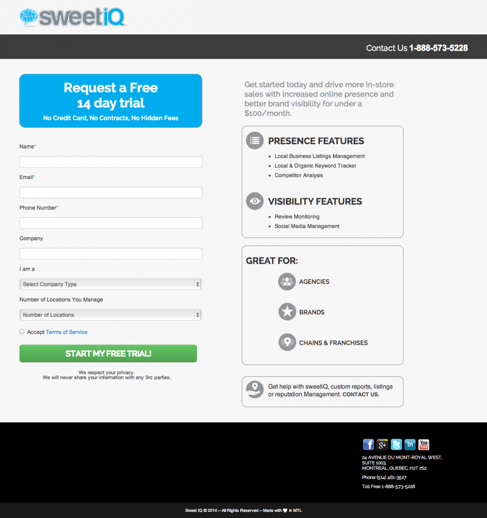
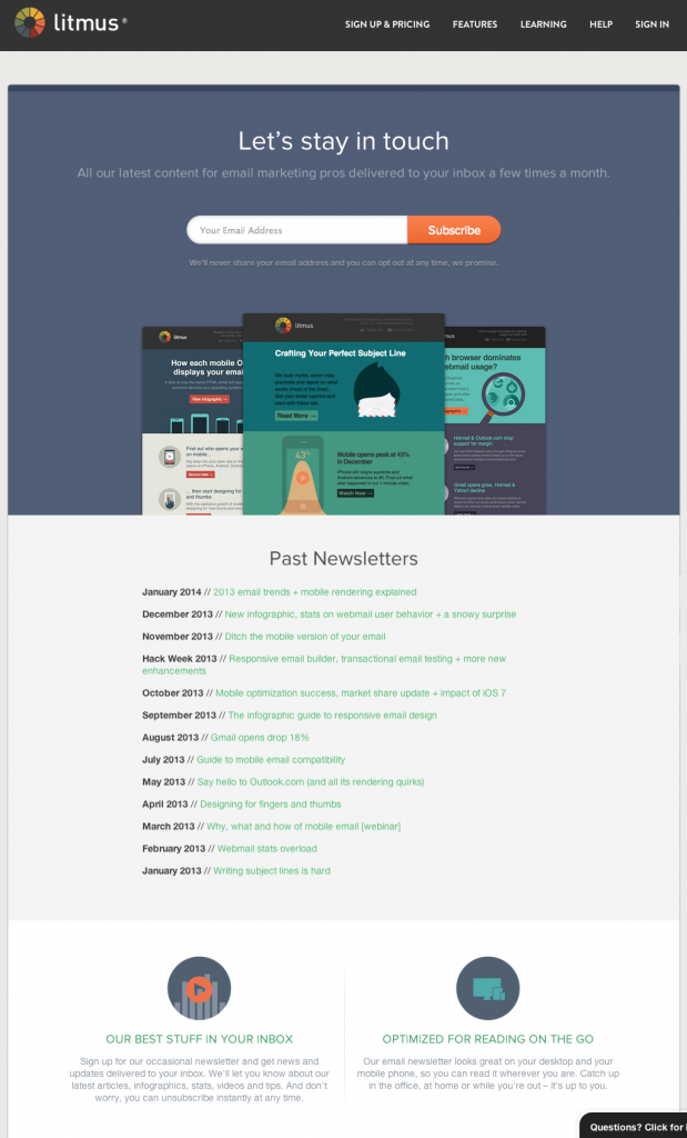
There are two types of landing pages, lead generation and click-through. A lead generation page is trying to get the visitor to submit their contact information. This can be for a free trial, an email newsletter, a free trial, basically anything.
A click-through page is a way for the visitor to learn more about the product in a low-pressure situation. They aren’t being asked to make a purchase yet, just to click to the next page, where they can make a purchase. Here are some examples of click-through pages.
Difference Between a Home Page and a Landing Page
Is a home page a landing page?
A home page and a landing page serve two very different purposes. A home page is an introduction to your site, it acts as a portal for the visitor to access the rest of the site. A landing page, however, serves one purpose. The only reason it exists is to get a visitor to do one specific thing, whether it’s click through to another page, register an event, basically, any one thing that you want people to do.
Home pages and landing pages are two different elements of web design; they serve different purposes and meet different user requirements.
What Makes a Good Landing Page?
A Goal-Your goal is the ONE thing you want someone to do when they visit your site. Are you trying to get them to click through to this page to go buy your product? Enter their email address for a subscription to your newsletter? It’s important to determine the goal of the landing page early on; your headlines, copy, and overall design will be based on your goal for the page. Speaking of headlines…
Strong Headline– The headline of your landing pages is one of the most important elements. This is the first thing your visitors are going to read when they come to the landing page. The headline needs to be relevant to both your content and the link that brought them to this page. Keeping these messaging the same will keep the visitor from getting confused and going back, keeping your bounce rate low.
 Relevant Copy– The main purpose of the copy on a landing page is to convince the reader that they will benefit from doing whatever you’re asking them to do. But, that doesn’t mean this content is a selling pitch; it’s a conversation with the visitor. As with all web copy, it should be easy to scan. Stick to short paragraphs, bullet points, and keywords in bold. A big block of text is intimidating to a visitor, so break it up and make it easy for your visitor to read.
Hidden Navigation– It’s been proven that removing navigation from landing pages increases conversion. By removing navigation, menu bars, and even social media links, you’re forcing your visitor to focus on your content. They’re less likely to get distracted and move away from the page if they don’t have the option.
Brief Forms– If your landing page includes a form, ask yourself what information you really need from visitors. The fewer information users have to fill out, the more likely they are to complete the process, so keep the form brief and the information you require minimal.
If you can, avoid using captchas. People see them as a hassle and won’t bother completing the form.
Free Trial Registration
Call to Action– Your call to action is the most important part of the copy. Want them to subscribe to your newsletter? Buy something? Ask! Your call to action (CTA) should be supported by the rest of the content on your page. The point of the landing page is to ask the visitor to do it- this is your opportunity to earn your conversion!
A lot of marketers are going to tell you to place your CTA above the fold based on the fact that only 20% of people read below the fold. But the fact of the matter is, it’s not the placement that matters, it’s the content surrounding it.
Optimized for Search Engines- What good is your landing page if no one can find you? Identifying and using keywords in your headlines and content will help you earn a higher ranking in search engines. But, make sure you aren’t sacrificing good content for the sake of a high ranking. Here’s how you can find the balance in writing for both humans and search engine robots.

Optimized for Mobile- With over a quarter of all web searches done on a mobile device, you need to optimize your landing page for a mobile device. If the page doesn’t load well on the user’s smartphone or tablet, they’re going to hit the “back” button and go on to the next search result.
Simple Design- Landing pages are not the place to show off your design skills. Keeping the page simple keeps the visitor focused on the important parts aka your call to action. A page filled with a lot of stock photos and graphics will make the page seem cluttered and could distract the user.
Keep in Mind…
You want to keep the same messaging and imagery. If your visitors are coming from a paid ad, If they come to a site that looks completely different they’re going to assume the page isn’t relevant and hit back. Keeping a consistent feel through your ads and landing pages reduces bounce rates by reassuring visitors they’re on the right page.
What landing pages can do for you
Landing pages allow you to bring a targeted audience to a page designed for them. By segmenting your audience, you can better cater your marketing efforts toward each type of visitor.
Do you want to test out copy? Landing pages are an easy way to use the A/B test on different copy lengths, various headlines, and different designs to determine the best way to meet your conversion goals.
and most importantly, your landing page can earn you more conversions.
By directing the right people to the right page and prompting them, you’re more likely to not only see more conversions but higher quality conversions. You’re getting people who are actually interested in your business to sign up for an email newsletter. Your landing page is your opportunity to convince people that, YES! This is something they want. They have to sign up for your free trial. They’re ready to move on to the next page and make a purchase.
Ready to get started? NEXTFLY can help incorporate landing pages into your online strategy. Give us a call, and let’s chat!
