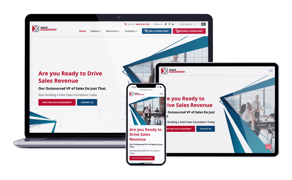
When you hear the term “Above the Fold,” you may hear it in a conversation involving a website; however, where did the term originate? This saying took hold with newspapers and tabloids. Papers were displayed and delivered folded with only the top half of the front page visible. The visible portion of the newspaper often held the most important headline for that particular paper. It was used as a way to grab the viewer’s attention and entice them to buy a newspaper.
Above the Fold and Web Design

During the 1990’s, many publishers moved from only having physical papers to having a web design presence. In the course of this change, it was very important to have the same idea to evolve to a more digital age.
For web design, Above the Fold means any content that shows before you have to scroll down on a website. For many new computers, this is approximately a height of 720 to 900px depending on how large your monitor is. Any content that is not visible right away is considered below the fold. This is any content that you need to scroll to view.
One thing that throws a wrench in the idea of Above the Fold is responsive web design. With websites having to work on all sized desktops, tablets, and phones, your Above the Fold content may get hidden. Even if this is the case, it is extremely important to be sure that all of your important information can be seen with the least number of scrolls possible.
Why is Above the Fold Important?
 The placement of your content Above the Fold is extremely important since it tells the story of your business/company goals. When a visitor navigates to your website, they should instantly know the purpose of your website. Having this information at the top of your website will ensure that your guests will find what they came for and not have to leave your website for a competitor.
Another important piece of information to have Above the Fold is a Call to Action (CTA). A call to action is a button or prompt that drives your visitor to complete a certain action, whether it is scheduling a service, making a purchase, or using a contact form. Call to Actions usually have a phrase, such as: Buy Now, Contact Us, Sign Up, and many more.
Do You Think Your Website Tells the Right Story?
As I do every website analysis, my first step is to navigate to the homepage and see if I can determine what that website’s purpose is. You would be surprised how many people hide their services below the fold if at all. Next time you are on your computer, pretend you are a visitor that has never seen your site. Can they easily determine what you do? Are they able to easily make a purchase/signup/reach out?
If you answered no to any of these questions, maybe it is time that you redesign your website. If you would like to have one of our expert Marketing Specialists do a full analysis of your website, please do not hesitate to reach out to us!
